ECOTILS
IKEA Self Check-out Experience Redesign
X
Xiaodi Tang, Janita Siriseth, Julian van Deursen
Margo Welling, Thomas Imhoff
Feb 2019 - May 2019
Introduction
This project is a collaborative course project between Delft University of Technology and the IKEA Design Centre in Delft. Commissioned by the IKEA Design Centre, our task was to optimise and redesign the user experience issues in the current self-checkout area of IKEA stores within a four-month timeframe.
The project team consisted of 5 design master students from 3 different countries. Together, we shared our opinions and executed the entire redesign cycle, which included research, analysis, definition, design, prototyping, testing, iteration, and evaluation. Throughout the project, we independently planned the workflow and selected appropriate design methods to ensure objective and effective progress at each design stage.
"What did we design?"
To enhance user interaction and experience, as well as align with the IKEA brand and shopping experience, we presented a comprehensive user experience design proposal to the IKEA Design Centre. This included the physical counter and the user interface, along with general recommendations for the spatial layout of the self-checkout area.
Customer Flow and Spatial layout


To make accessing as simple and easy as possible for both customers and employees, the layout is arranged in a linear plan as shown in the figure. The connection of the surroundings and the new design is shown in the rendering. The render shows that the shape of the design allows the consumer to be able to see all the points of interest on the self-scan checkout when standing in front of the self-scan checkout. The consumer will have more time to inspect the self-scan checkout, which should lead to fewer errors since they can better prepare for the process.


Self check-out counter

A
B
C
D
E
FGH
I
Light indication
STEP 1: Scan
Family card and SCAN&GO service
In-store bag recycling
Hook for bags
STEP 2: Payment
STEP 3: Enjoy
Out-of-store shopping bag placement
Shopping cart placement
User Interface


“How did we carry out the design?”
01
Description of the Context
1). The Self Check-out Issue
“To create a better everyday life for the many people.”
-- The IKEA vision, values and business idea
IKEA Delft introduced the self scan checkouts next to the standard checkouts to give customers the option to complete the buying process themselves. Self scan check-outs are where customers scan, pack and pay for their shopping. As a high-volume store, IKEA Delft processes significant numbers of customers and transactions daily. The self check-out system was presented as a solution to alleviate long queues at checkout counters. Its compact footprint allows more customers to complete transactions quickly. However, the current self-checkout area has not achieved IKEA's intended results. Firstly, it has not received high satisfaction ratings among customers, and due to various reasons, its efficiency is even lower than that of the manned checkout areas. This project began with identifying and analysing these issues.

2). IKEA Delft In-store Experience
The figure above is an adapted version of TOTE-M’s IKEA in-store journey map, based on the IKEA Delft store with minor modifications.
It clearly shows that the checkout experience is one of the negative aspects, while the product trail is the most popular section, and the hot dog serves as a peak-end highlight.
To better understand the overall in-store experience in the context of the Delft store, the derived figure illustrates the store’s layout and customer emotions in each area. Apart from the "saviour" hot dog, most areas on the ground floor elicit negative experiences, indicating significant potential for improvement and opportunities for us to contribute.


3). Product Analysis
According to its functional classification, this physical product has been divided into 6 parts:
1
Status indicator
2
Digital display
3
Bag storage
4
Stuff placement
5
Scanning device
6
Payment devices
4). User Interface
Based on the Usability Heuristics proposed by Nielsen in 1994, the problems identified on the user interface mainly fall into the following aspects.

1
2
3
4
5
Visibility of System Status
The indicator lights are disordered, and there is no position indication; therefore, users cannot know the current step and status.
Match Between System and Real World
Language used in the interfaces is impersonal and technical. Animations are generic, demonstrating only actions without generating engagement with users.
Consistency and Standards
The text, buttons, icons and layout lack consistent, there is no visual hierarchy in size, colour, and placement.
Aesthetic and Minimalist Design
The interface requires excessive instructional text throughout the process, while rarely used buttons are given disproportionate prominence.
Help Users Recognise, Diagnose, and Recover from Errors

The system lacks clear auditory or visual cues to guide users through the process, alert them to errors, or signal when employee assistance is required.
02
Design Brief
1). Context of use
The onion diagram was compiled and summarised by us based on the information collected through meetings with IKEA staff and field investigations. It systematically presents the interrelated factors that extend from the core theme of the ECOTIL self-checkout. These factors include physical equipment, user groups, environmental factors, as well as the brand culture provided by IKEA for customers.

2). Intended operation
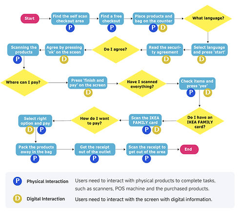
Above is a diagram depicting the product's intended usage flow, starting from when the user completes item collection in-store through to checkout area departure. From this task flow diagram, the interactions between people and physical devices, as well as the interactions between people and digital screens, for each task node are marked. It can be seen that in such a checkout process, there are multiple instances of physical interaction followed by digital interaction, which implies that users need to switch their attention between the screen and other devices frequently. It poses a significant challenge to provide users with a smooth and coherent checkout experience.
3). Target Users
Based on the observations at IKEA, four different personas were developed, in order for the team to be able to take into account different types of users in the design process.


3). Design Goal
The goal of this project is to design a experience with ...
a. Seamless Interaction
-
Enhance the overall flow of the checkout area, considering both the broader spatial design and individual checkout stations.
-
Use strong visuals and intuitive interactions to guide users effectively.
-
Streamline the interaction between physical and digital elements for a more natural user experience.
b. Simple and easy products

-
Provide a transparent overview of the checkout steps, including the user’s current position in the process.
-
Ensure users understand what to expect and the actions required to complete checkout.
-
Design the interface to be easily understandable through visuals alone, minimising reliance on text.
c. Family-Friendly Self-Checkout
-
Optimise the self-checkout design for family use, ensuring ease of navigation for groups.
-
Structure the checkout area in a more organised and user-friendly way.
Fast
Consumer in control
Family-friendly
03
Design Creation
With the design brief, the team began ideating and created concepts that were tested and converged into one redesign proposal. The designing and evaluating of the redesign proposal formed the final design phase, where every interaction detail was worked out, tested, and adjusted to answer the design brief. The result of this process is a final redesign proposal for the IKEA Ecotil, along with additional recommendations. The overview of the design process is shown in the following graph.


04
User Experience Accessment
1). Test setup

2). Prototype test


3). Test Result


3). Conclusion and Reflection
From the test results, the good and bad points of the redesign proposal are concluded by questioning why things went wrong or well. These advantages and disadvantages are listed one by one in various aspects, including physical interaction, digital interaction, user guidance, user assistance, visual aesthetics, etc. We identified several key issues and conducted a reflection on them.
Experience
01
Users should be able to understand and use the product easily from the first time.
02
Users should feel that the self-scan area is part of the whole IKEA experience.
03
The user should not perceive errorsas their fault. They should perceive it as anaccident that can happen.
Direct actions
01
The users should be able to operateand exit the self-scan checkout without havingproducts accidentally not scanned or scanneddouble.
02
The user should be able to operate the checkout together. The user often comes to IKEA as a family or a small group and operate the checkout together. The actions of one person in the group should not lead to errors to another person operating in a different part.